- 0.1 Accessibility Resources
- 0.2 Who does what
- 0.3 Checklist
- 0.4 Screen readers we support and how to use them
- 1.0 Buttons and toggles
- 1.0 Bypass blocks
- 1.0 Focus Indicators
- 1.0 Images and Decorative Elements
- 1.0 Landmark structure- structuring elements correctly for screen readers
- 1.0 Modals
- 1.0 Tables
- 1.0 Tabs
- 1.0 Test Evidence Spreadsheet
- 1.0 Tooltips
- 1.1 Perceivable - Text alternatives
- 1.2 Perceivable - Time-based media
- 1.3 Perceivable - Adaptable
- 1.4 Perceivable - Distinguishable
- 2.1 Operable - Keyboard accessible
- 2.2 Operable - Enough time
- 2.3 Operable - Seizures and Physical Reactions
- 2.4 Operable - Navigable
- 2.5 Operable - Input Modalities
- 3.1 Understandable - Readable
- 3.2 Understandable - Predictable
- 3.3 Understandable - Input Assistance
- 4.1 Robust - Compatible
Tables
Accessible tables need HTML markup that indicates header cells and data cells and defines their relationship. Assistive technologies use this information to provide context to users.
Header cells must be marked up with < th >, and data cells with < td > to make tables accessible.
Sometimes the data can’t be distinguished from one another without knowing which header each corresponds to. The scope attribute with the value of either col, row, rowgroup, and colgroup defines the direction of the header cells and associates them with the corresponding data cells. The scope attribute is also needed for larger tables with one header row or column.
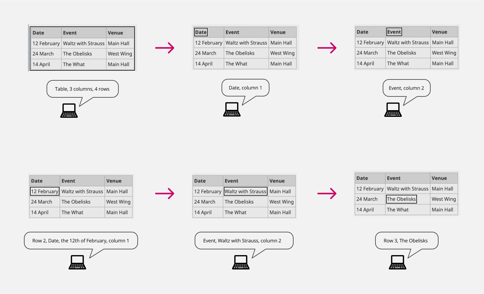
One example: tables with a single header

Based on where you are going to in the table and where you are originating from the screen reader will OMIT certain values. For every possible scenario and screen reader testing please visit:
https://www.w3.org/WAI/tutorials/tables/
Blank cells
Some tables may require blank spaces to be left where there is no data present.To ensure a screen reader can recognise and read empty cells in tables you can either
- Leave the cell empty
- Add an to the empty cell
This has been tested in Safari (Voiceover) and NVDA (Firefox), both read “Blank”
Tips and tricks
Keep data separate Make sure that each separate piece of data has its own cell. Don’t use headers in one column and all data in a second column, as this will make it almost impossible for screen readers to work out the relationships between data across columns.
Zebra tables Styling even and odd rows in a different way can be helpful to people who have reading difficulties or who enlarge text. It acts as a visual guide. Highlighting the cell (and row/column) on mouseover and keyboard focus to support people to see where they are. Make sure that the contrast ratio between the text and background is good for both headers and data cells.
Alignment Align text to the left and numeric data to the right (in left-to-right languages), so that people using larger text sizes or smaller screens will be able to find it. This is especially useful if a cell spans more than one column. It’s helpful to give column headers the same alignment as the data in the cells below.
Header cell styling
< th > elements are used for header cells, using < td > elements with different styling will make tables less accessible if not inaccessible. It is also helpful to differentiate < th > and < td > cells visually.